|
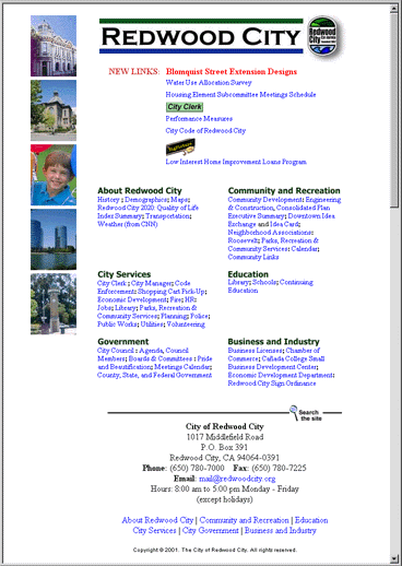
Overall, there's a tremendous amount of content for users to wade through, and the task is made difficult by:
- A minimal organizational scheme, without much chunking of content.
- Few visual cues to orient the user about where to find what sort of information.
- Inefficient layout with a great deal of wasted space.
- Small, hard-to-read text.
Though no testing has been done, I would expect most users to have difficulty finding what they need on the current homepage.
|