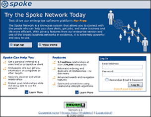
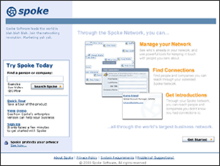
Product Launch Page

The launch page for Spoke's public network aims to draw in potential users, but faced with the "Before" screen below, few visitors completed even the first step of registration. The redesign, which was designed and implemented in a week, aims to make Spoke's value clear and appealing to first-time visitors.
 
Before
 
After
 
Problems
  • The text is overwhelming. Worse, it doesn't say anything a user is likely to care about. Scanning the main elements tells the user nothing about the value of the product.
  • Controls are scattered -- not clear where to go for what.
  • Focus is on the product (features) rather than on the user (benefits).
  Solutions
  • Less text. This design cuts out the fat and makes better use of visuals to convey the core message.
  • Scans well. Headers contain information the user is likely to care about.
  • Better organization of information; clearer call to action.
  • Very clear focus on what value the user will get from the product, presented in a tangible way.
  • Gives user a taste of the product without giving away the store.